ZISA
Visual Identity
A visual identity developed around a bold bilingual logotype and a minimal graphic system, designed to remain recognizable across both digital and physical applications.
My Role: Brand Identity, Visual System & Art Direction
#C8102E
#111111
#F4F4F4
The Concept
The identity was built around creating a visual connection between the Persian and Latin versions of the ZISA name. A shared geometric structure gives both logotypes a consistent personality while allowing each script to retain its own character.
Logo Construction
A modular geometric system was used to define proportions, spacing, and consistency across the logo family.



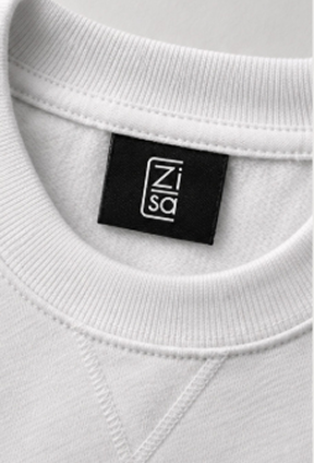
Brand Applications
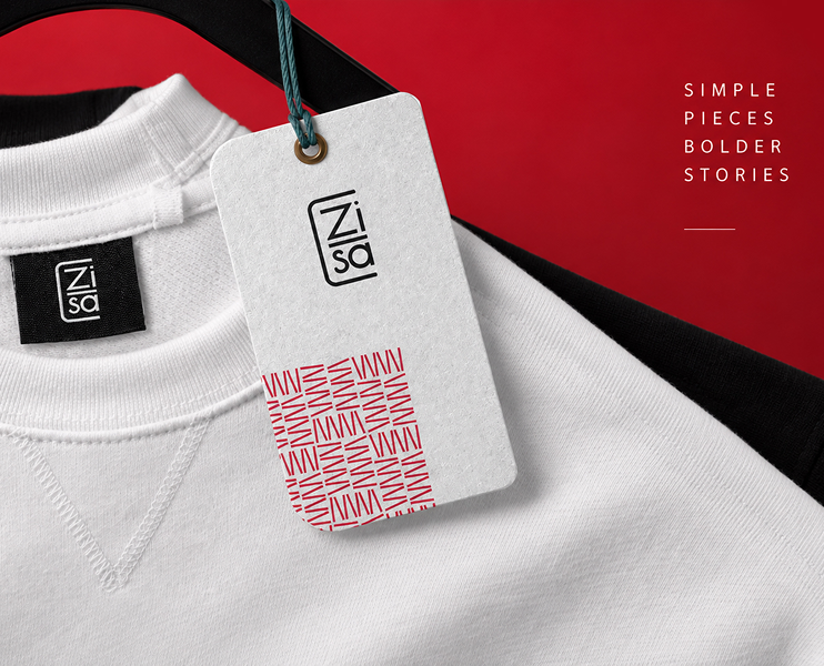
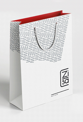
The visual system was extended across apparel, packaging, labels, and other brand touchpoints to create a consistent and recognizable identity.
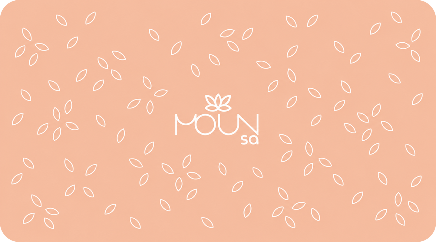
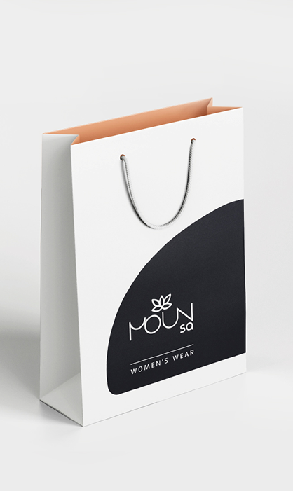
MOUN SA
Visual Identity
A visual identity developed for the womenswear line of ZISA, designed to feel independent while maintaining a subtle visual connection to the parent brand through a softer, more fluid design language.
My Role: Brand Identity, Visual System & Art Direction
Everyday Women
Brighter Together
Pantone 3262 CRGB 00 176 173
HEX #00B0AD
Pantone 162 CRGB 255 190 159
HEX #FFBE9F
Pantone Yellow CRGB 255 217 00
HEX #FFD900
Pantone 178 CRGB 255 89 90
HEX #FF595A
The Concept
Developed as the womenswear line of ZISA, MOUN SA was designed to feel independent while maintaining a subtle visual connection to the parent brand. Softer lines and fluid forms create a gentler expression, while shared structural elements preserve a quiet family resemblance.
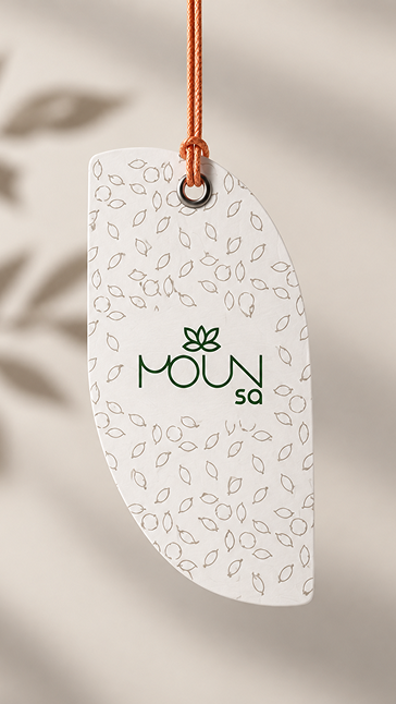
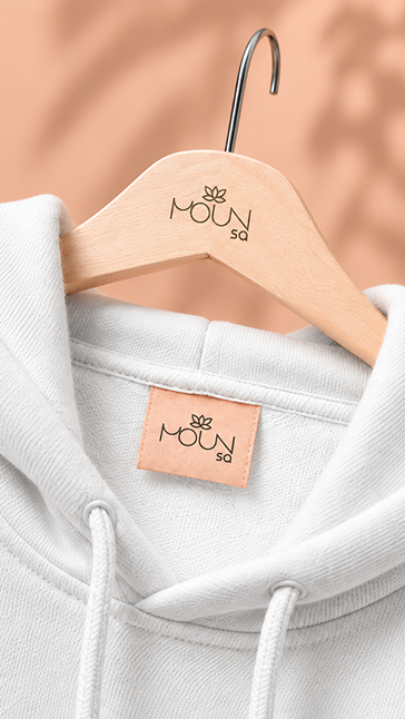
Brand Applications
The visual system extends across apparel, labels, tags, and packaging, creating a consistent and recognizable identity across brand touchpoints.
Logo Construction
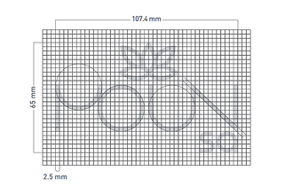
A softer geometric structure combines fluid curves with precise proportions, creating a distinct logo system that still feels connected to ZISA.

PIZZA E
Visual Identity
A complete brand identity developed from naming and concept to logo, copywriting, packaging, and brand expansion. Built around the Persian sound/letter «ی / E», the system translates a simple phonetic cue into a bold, youthful, and memorable pizza brand.
My Role: Naming, Brand Strategy, Concept Development, Copywriting, Logo Design, Packaging Design & Visual Expansion
E Like Enjoy!
Pizzaei Red#E10606
Kraft Beige#D7C9A7
Rich Black#1A1A1A
Clean White#FFFFFF
The Name, Concept & Copywriting
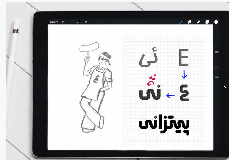
PIZZAEI was born from the Persian sound/letter «ی». The goal was to turn a simple sound into a memorable brand hook — local, modern, and full of personality. This playful idea shaped the name, the visual concept, and a youthful tone of voice for the brand.
Naming Strategy
Developed from the Persian letter/sound «ی», the name is simple, catchy, and distinctive — bridging a local identity with a bold, modern feel.
Visual Concept
The pizza-tossing character and the «E/ی» symbol create a bold, friendly, and recognizable identity that feels energetic and human.
Copywriting Direction
Playful, positive, and conversational. Short, memorable lines that start with «ی» help bring the brand to life and build a youthful tone.


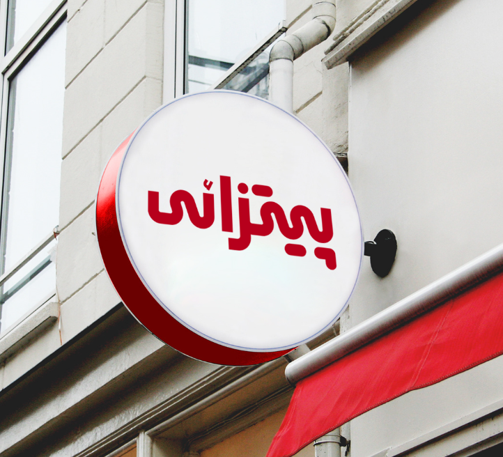
Persian wordmark

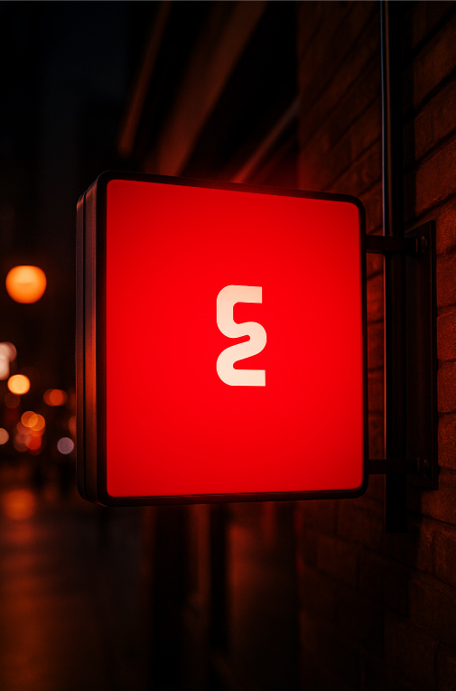
Symbol (E)
Packaging & Brand Expansion
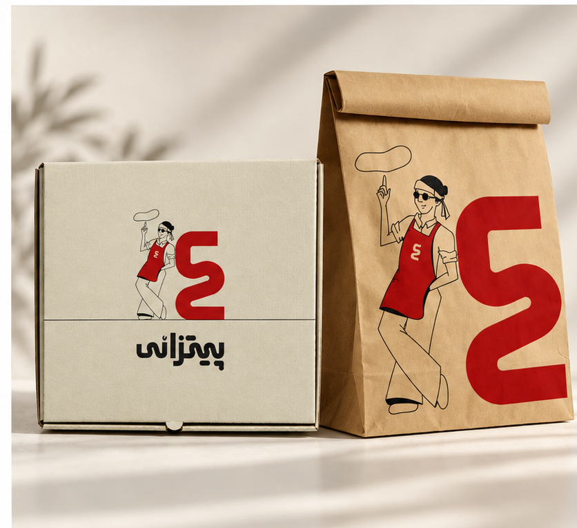
The PIZZAE (E) identity system was developed to extend consistently across packaging and physical brand touchpoints, while responding to one of the project’s key requirements: keeping production costs as low as possible without weakening the visual identity.
Packaging System
The packaging system was designed around a cost-efficient production strategy. To minimize printing expenses, the layouts were optimized for single- or two-color printing, limited print areas, and simple screen or plate-based production methods.
Rather than treating these limitations as restrictions, they became part of the visual language—resulting in packaging that feels bold, minimal, practical, and distinctly PIZZAE.
Brand Expansion
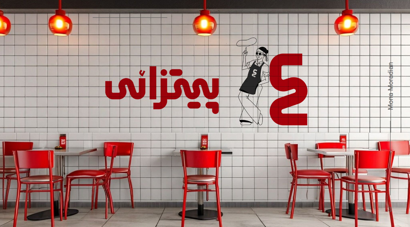
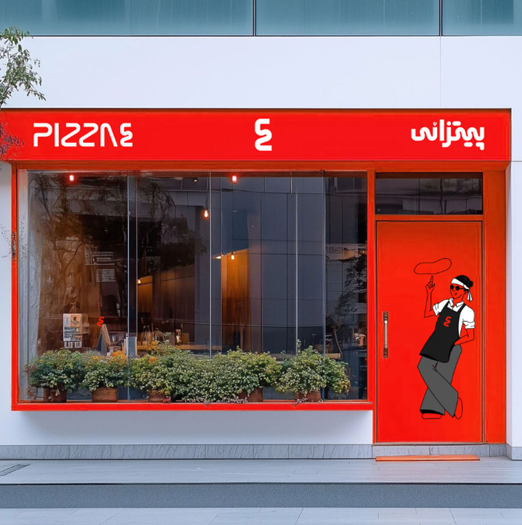
The same visual system was extended across storefronts, interiors, signage, and takeaway materials, creating a consistent brand experience while maintaining the same principles of simplicity, efficiency, and strong visual impact.
More Than Pizza!
FORTEEN
FORTEEN
Brand Identity
A youth-focused fast-food identity built around the double meaning of FORTEEN — referring both to teenagers and the number 14. The system uses illustrated teen personas to turn packaging into part of the brand experience, making every order feel playful, personal, and collectible.
My Role: Art Direction, Brand Identity, Visual System, Packaging Direction & Character Art Direction
The Idea
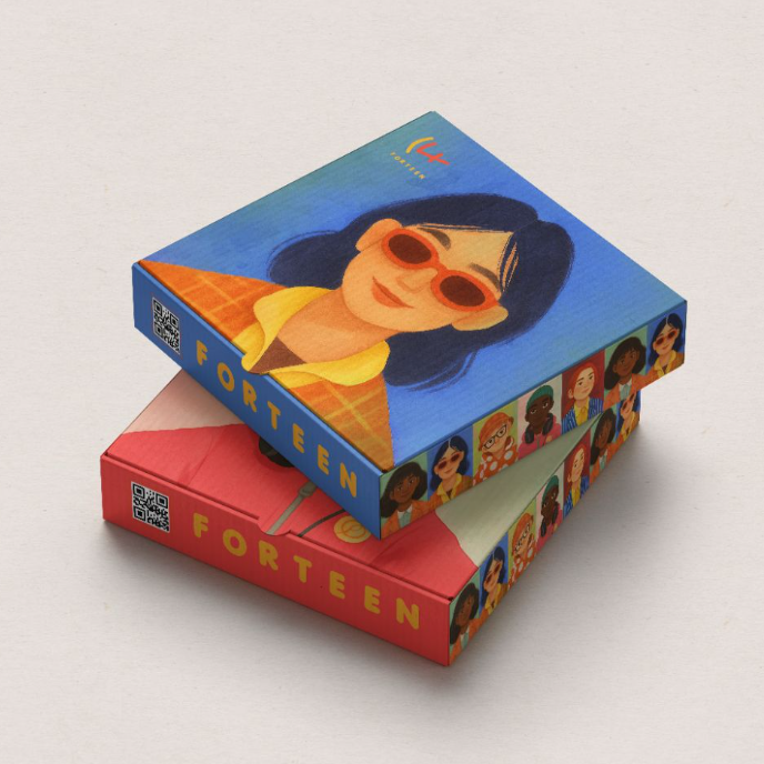
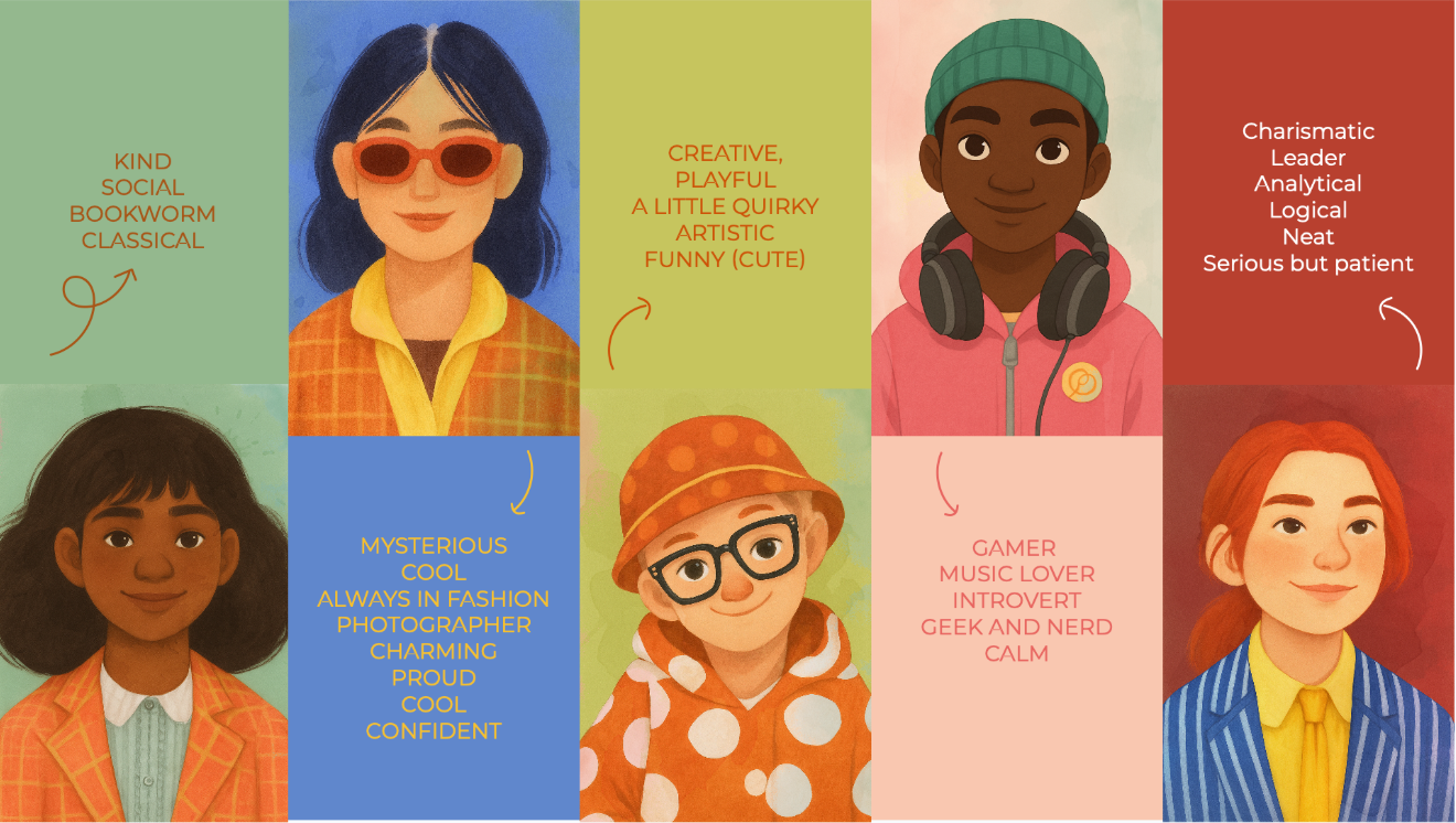
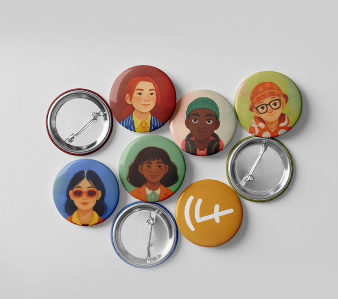
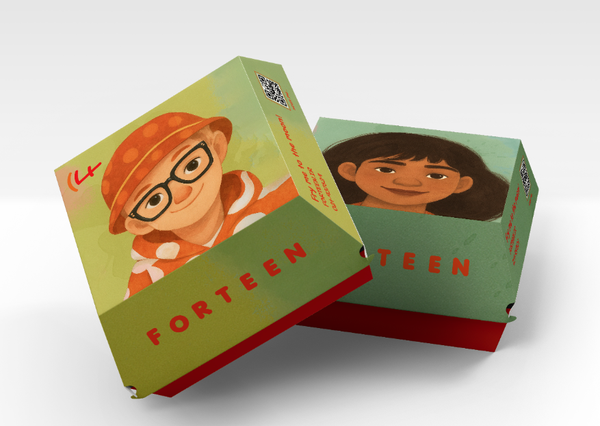
FORTEEN was created around the double meaning of fourteen and teenager culture. Each illustrated persona represents a recognizable teen archetype, turning the brand into something playful, relatable, and highly collectible for a young audience.
Character System
We developed a cast of distinct teen characters, each with their own style, mood, and personality. The illustrations gave the brand a human, expressive identity designed specifically for teenagers.
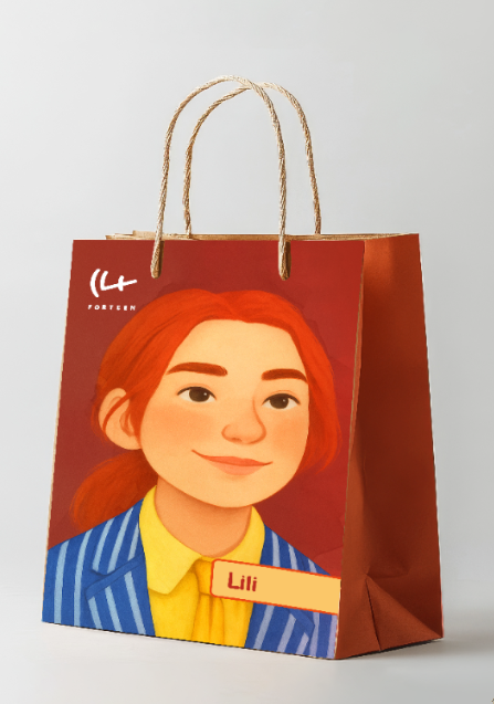
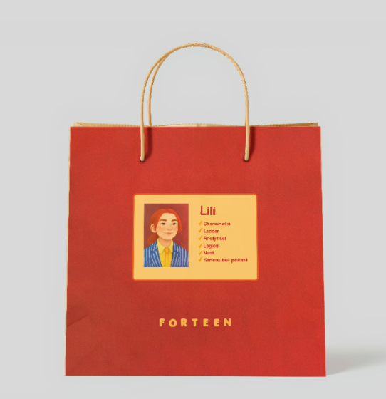
Packaging Interaction
Every order could arrive in a randomly selected character box, making the packaging feel collectible. Small previews of the other characters on the side panels encouraged curiosity about the next order.
Brand Applications
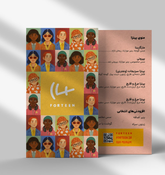
The identity extended across packaging, in-store communication, merch, and printed collateral while keeping the brand youthful, colorful, and easy to recognize.
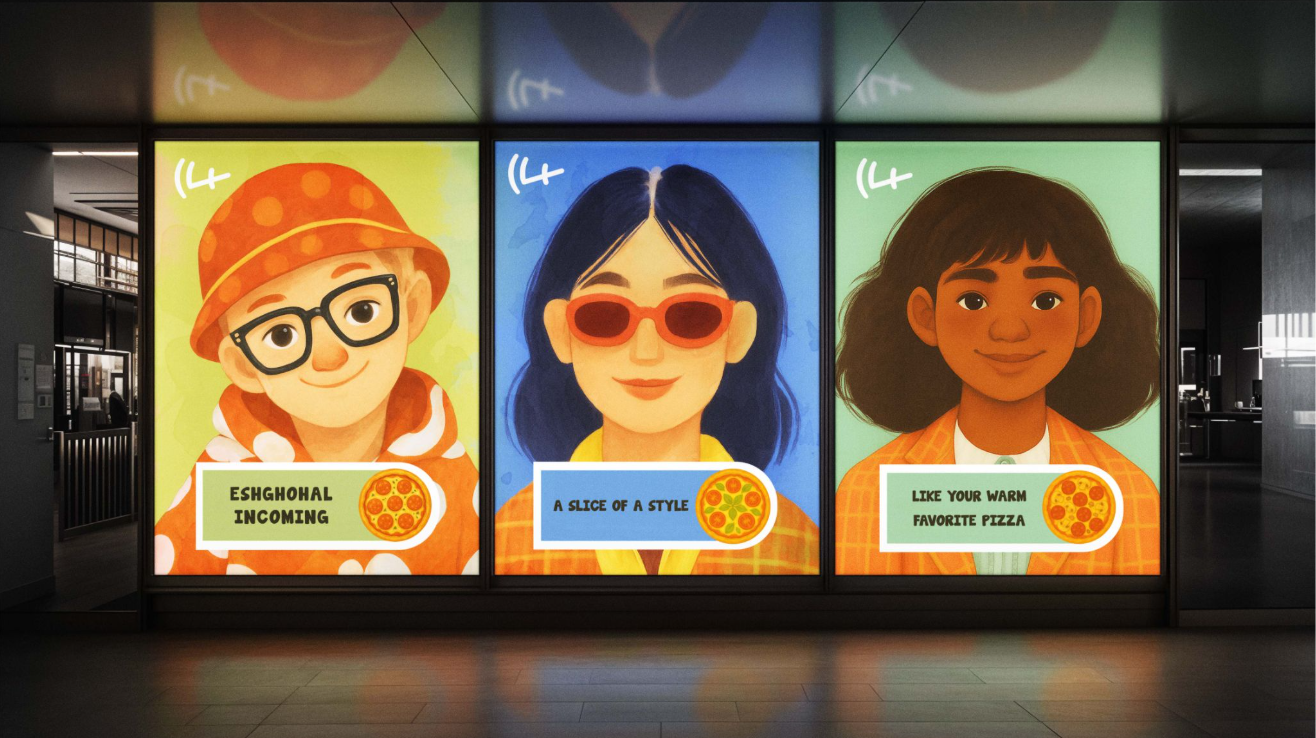
Spatial Communication
Character visuals were expanded into posters and environmental graphics to speak directly to teen audiences in a bold and playful way.
Merch & Touchpoints
Buttons, apparel, and small branded items helped the identity move beyond packaging and become part of a broader youth-oriented experience.
Menu & Collateral
Printed pieces such as menus continued the same visual language, using the character system and bright palette to maintain consistency.
FORTEEN
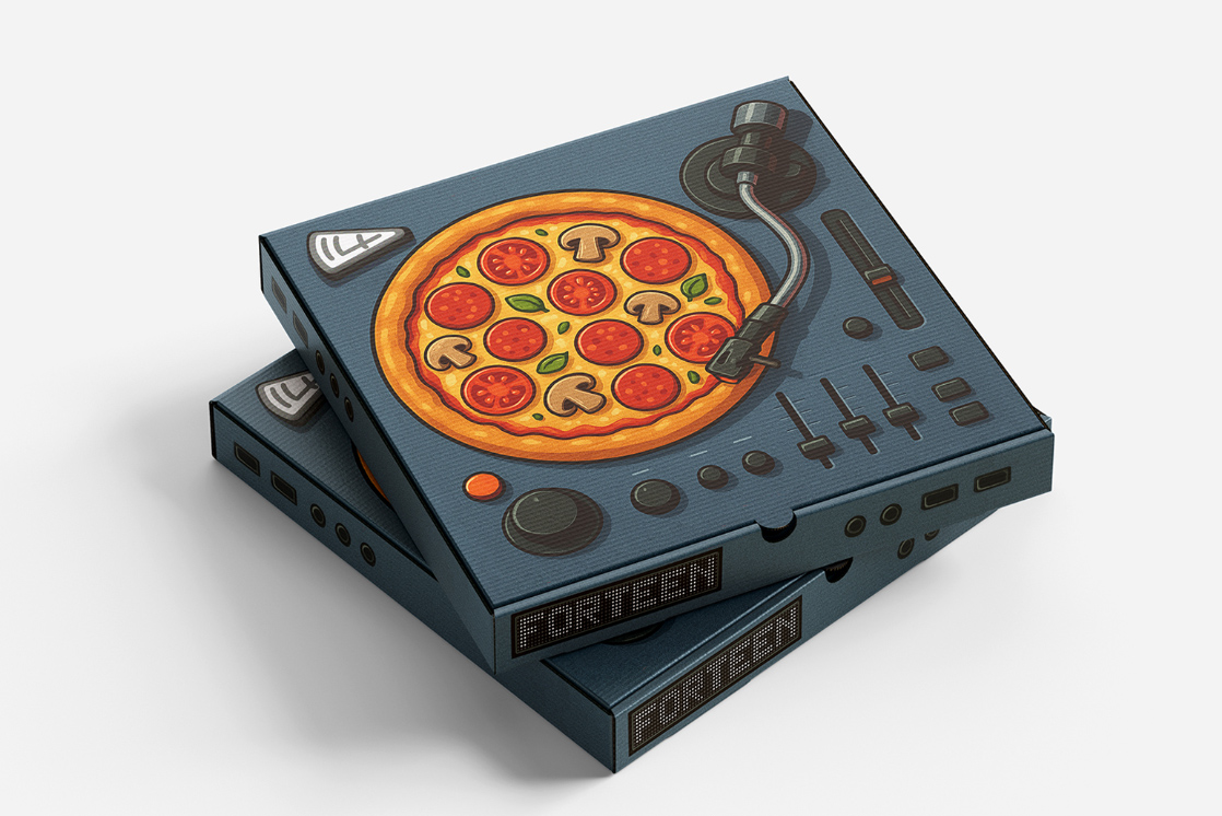
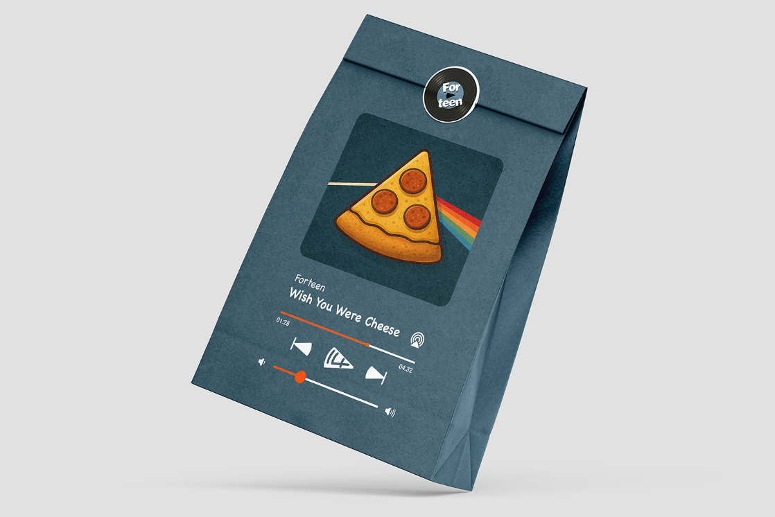
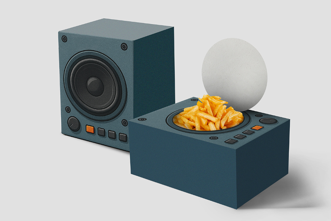
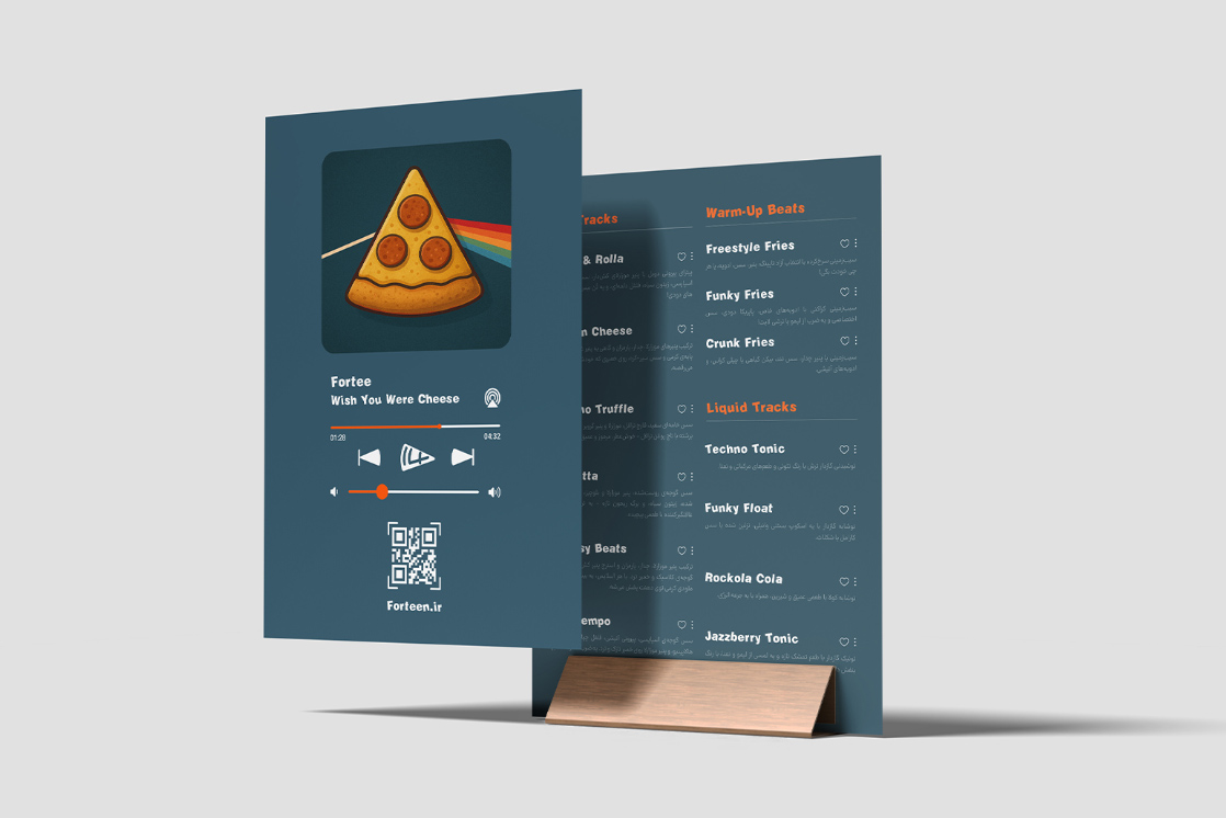
Music-Inspired Packaging Concept
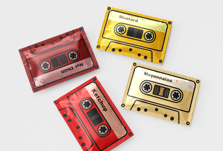
The second design direction for FORTEEN, built around music culture and teen energy. This concept turns packaging into playful, collectible touchpoints inspired by playlists, speakers, cassette tapes, and sound systems.
My Role: Art Direction, Brand Identity, Packaging Direction & Visual System
Food Meets Good Music