
TAPSIFOOD
Galactic Discounts
Space-inspired promotional campaign
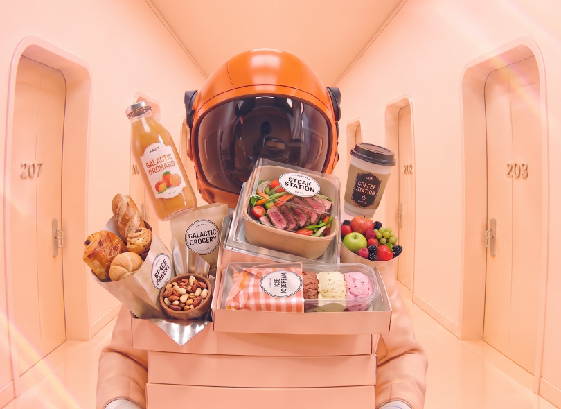
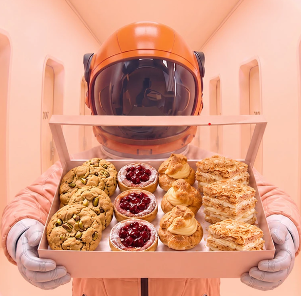
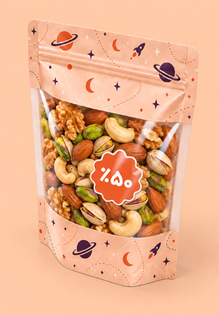
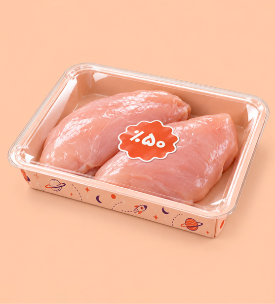
A space-inspired promotional campaign built around the idea of “Galactic Discounts.” The concept transforms a familiar promotional message into a playful zero-gravity world, where products, packages, and prices appear to float freely in space. The astronaut became the central character of the campaign, while floating objects and exaggerated product compositions were used to communicate the scale and excitement of the offers. A warm peach palette and futuristic environment helped create a distinctive visual world while keeping the products recognizable, appetizing, and at the center of attention. The visual system was developed to work across different product categories and campaign formats while maintaining one consistent concept and visual language.
My Role: Concept Development & Art Direction
Visual Execution: Design Team
TAPSIFOOD
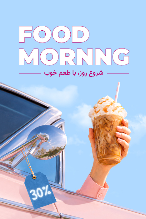
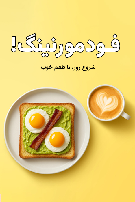
FOOD MORNING
behavior- change campaign
Turning breakfast into a new ordering occasion. Food Morning was created to introduce breakfast ordering as a new everyday use case for TapsiFood, beyond its stronger association with lunch and dinner. A limited-time morning discount helped encourage this new behavior. The name Food Morning, inspired by Good Morning, turned a promotional offer into a simple and memorable morning moment — aligned with TapsiFood’s focus on convenience, variety, and everyday accessibility.
My Role: Campaign Concept, Naming, Art Direction & Visual Direction
TAPSIFOOD
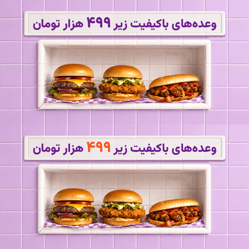
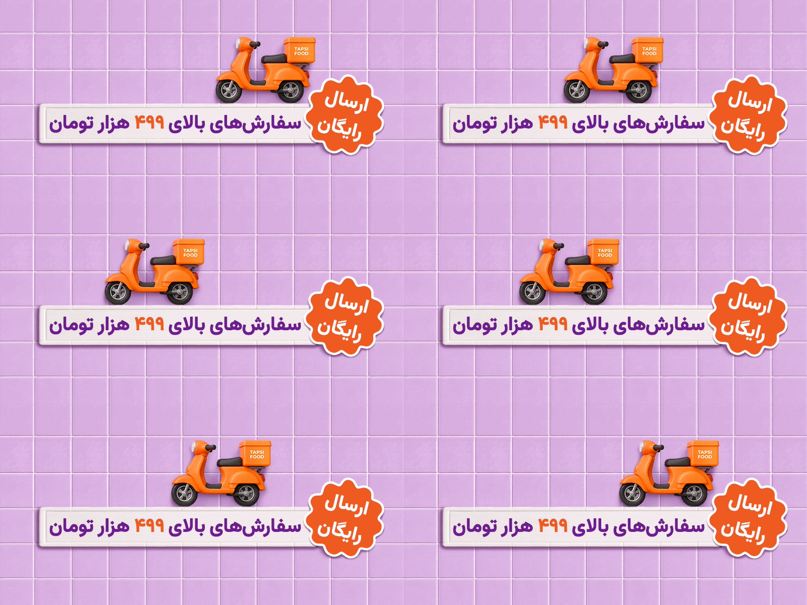
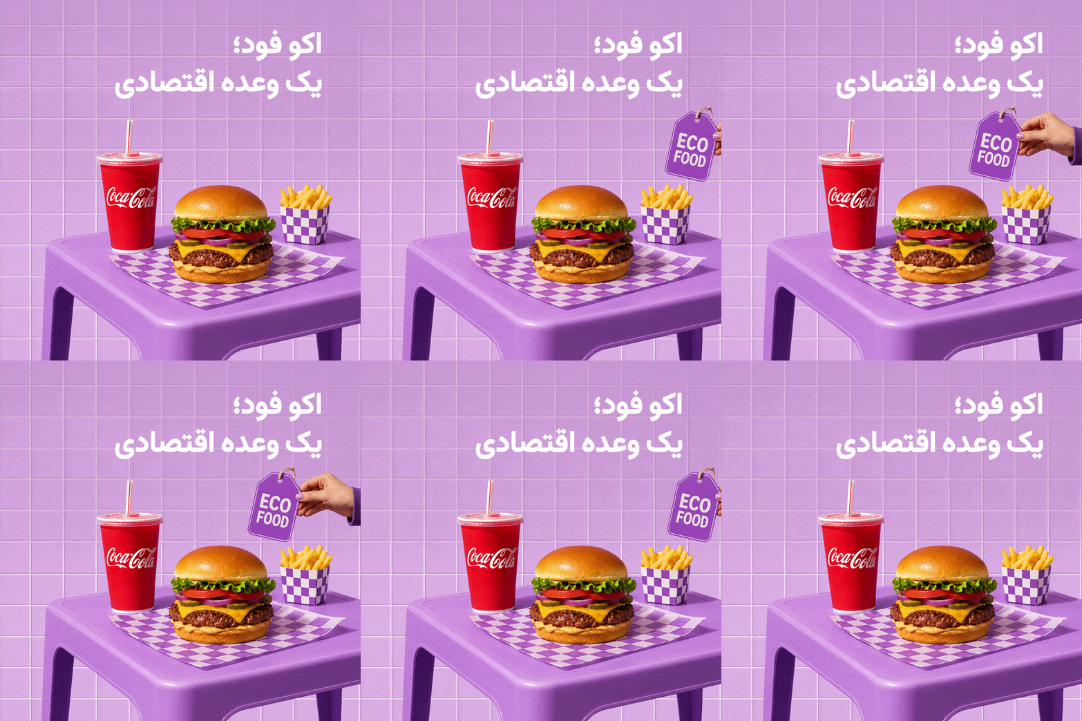
EcoFood
Affordable food without the “cheap” feeling.
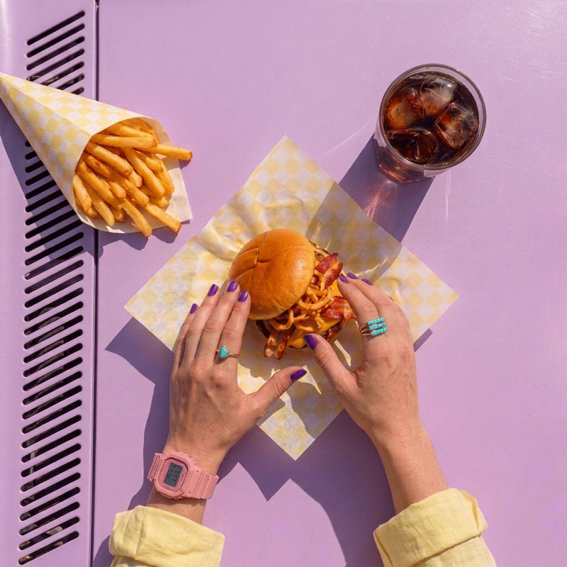
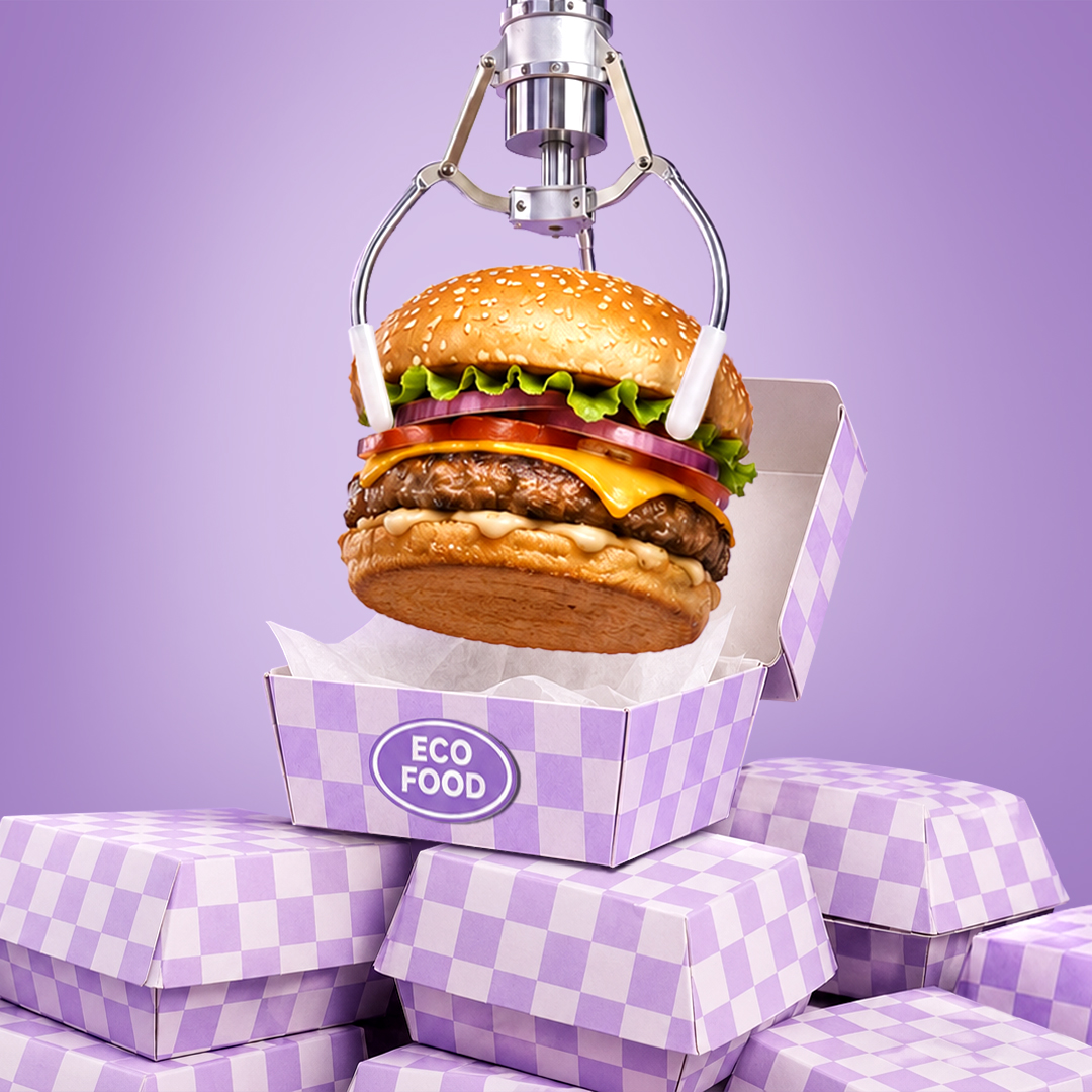
EcoFood was created to highlight high-quality, budget-friendly meals — options with lower prices, sometimes through smaller portions or fewer sides, while maintaining good overall quality. These offers were featured in the app during selected times of the day.
For the campaign’s visual identity, I chose purple — a color commonly associated with premium and luxury experiences. Using it in contrast with the idea of affordability helped position EcoFood as a distinct visual territory within the app while avoiding the negative perception often associated with “cheap” food. GIF banners were also used to attract attention quickly and increase visibility within the product experience.
My Role: Campaign Concept, Art Direction, Visual Identity & Motion Direction
TAPSIFOOD



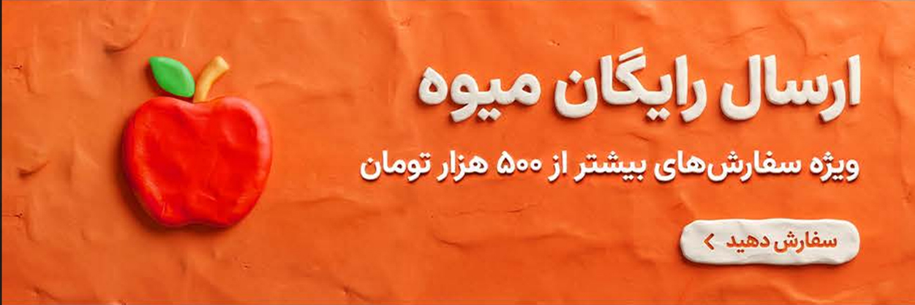
Ramadan Campaign
Due to limitations on using direct food photography during Ramadan, Clay Style was developed as the campaign’s core visual language. The approach allowed food products to remain warm, playful, and appealing without relying on realistic imagery, while giving the campaign a distinctive and memorable identity.
The visual system was extended across TapsiFood’s different business lines, creating consistency across multiple messages and touchpoints while maintaining a unified campaign look and feel.
My Role: Campaign Concept, Art Direction, Visual Style Development & Creative Direction
Digikala

Yalda Campaign
The goal of this campaign was to reinterpret the visual language of Yalda — one of Iran’s most iconic traditions — in a modern way that felt consistent with Digikala’s brand identity.
I used dynamic visual elements to create stronger attention and movement, while combining photomanipulation and photomontage techniques to achieve a clean, cohesive, and contemporary final look.
I was responsible for the project end-to-end, from the initial idea and concept development to art direction and final execution.
My Role: Concept Development, Art Direction, Visual Direction, Photomanipulation & Final Execution
Digikala
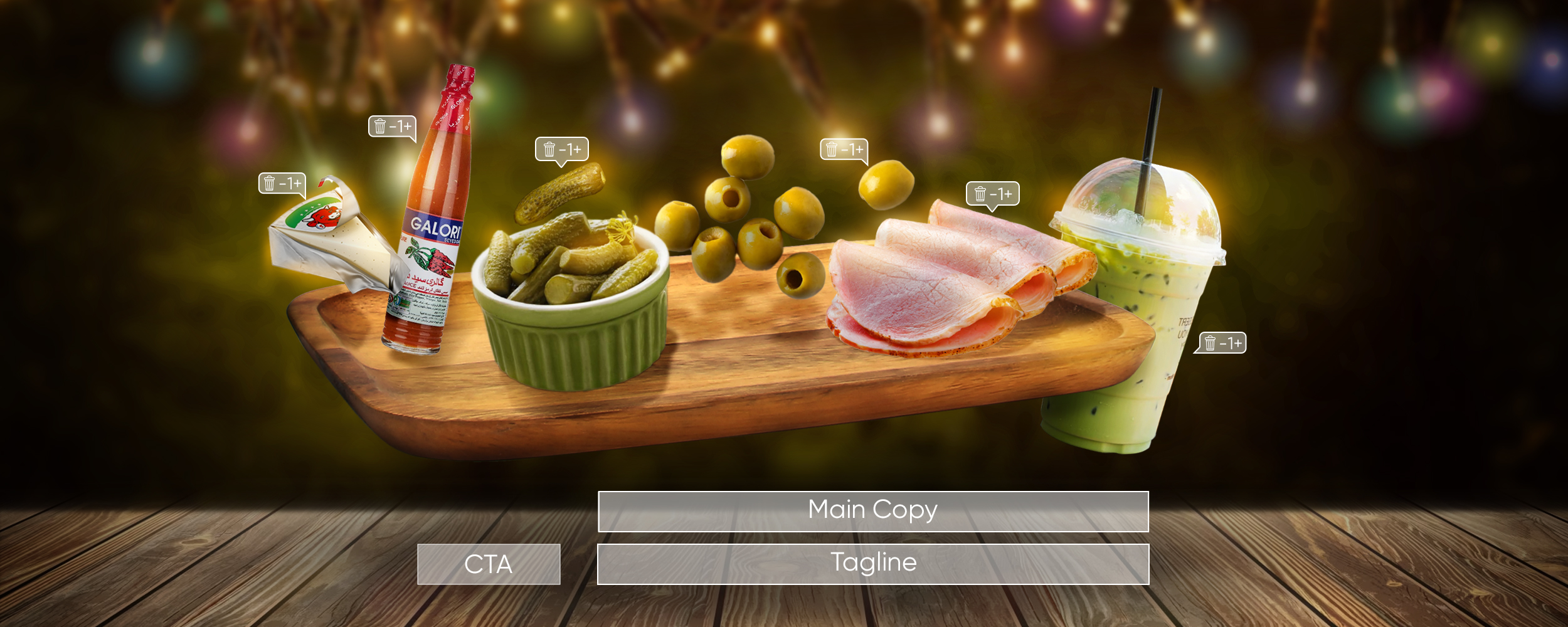
The “It’s time for… leave it to Jet” campaign was built around everyday moments such as breakfast, afternoon snacks, football, and gatherings. Its flexible slogan structure allowed the message to adapt to different situations while maintaining one consistent campaign identity.
My Role: Concept Development, Campaign Idea, Art Direction & Execution
Digikala
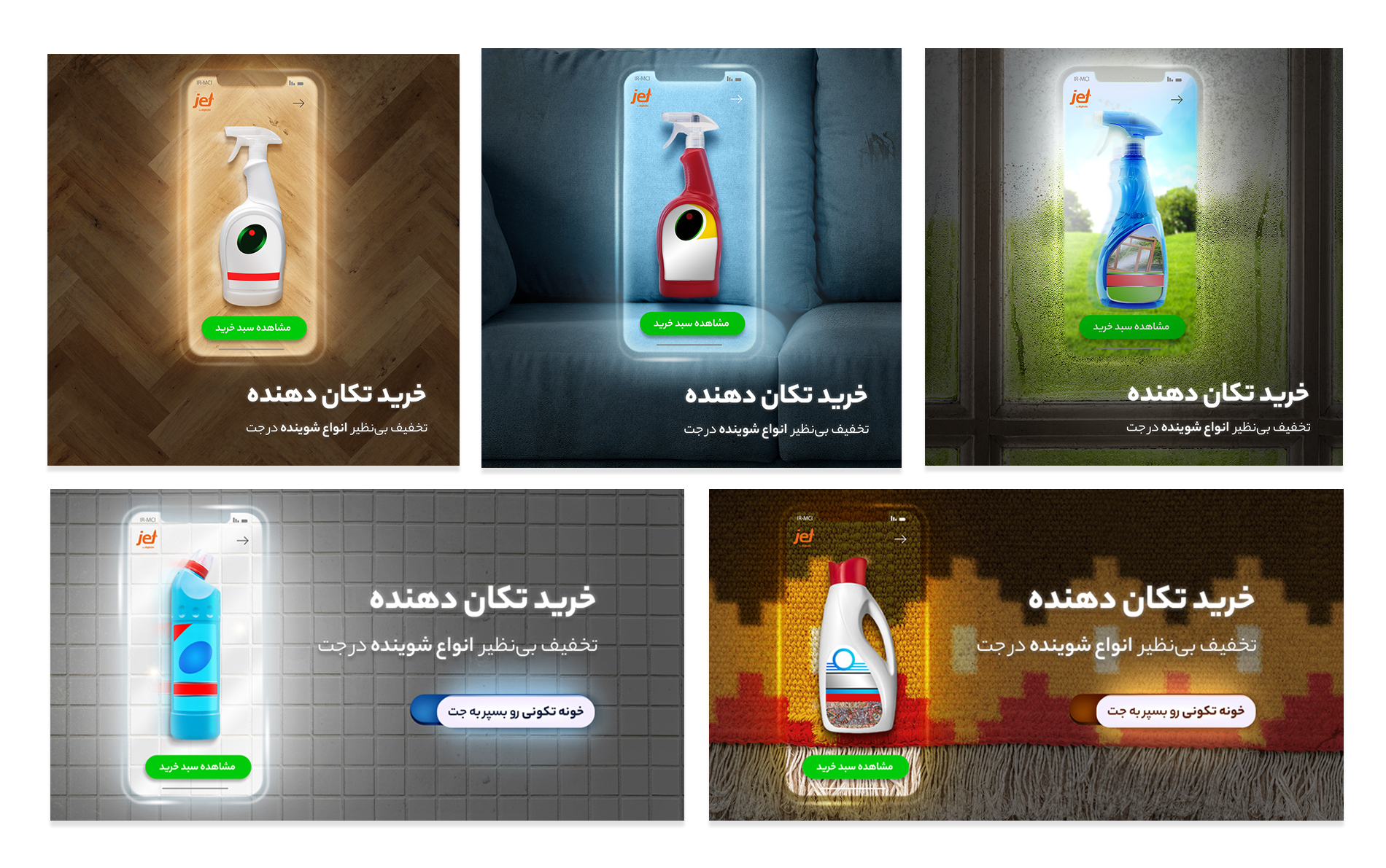
The “Shocking Shopping!” campaign was inspired by the Iranian tradition of spring cleaning before Nowruz, a period when cleaning products become especially relevant. The concept played on the idea of a “shake” — connecting the cultural context of house cleaning with bold, “shocking” discounts.
The visual direction was designed to extend the wordplay into the campaign artwork, creating a consistent connection between the idea, message, and seasonal context.
My Role: Campaign Concept, Copy Idea, Art Direction & Creative Direction — developed end-to-end with my team
ALIBABA
Awareness Campaign · Key Visual
Accessible from Anywhere in the World
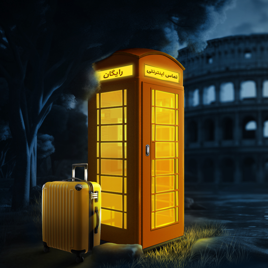
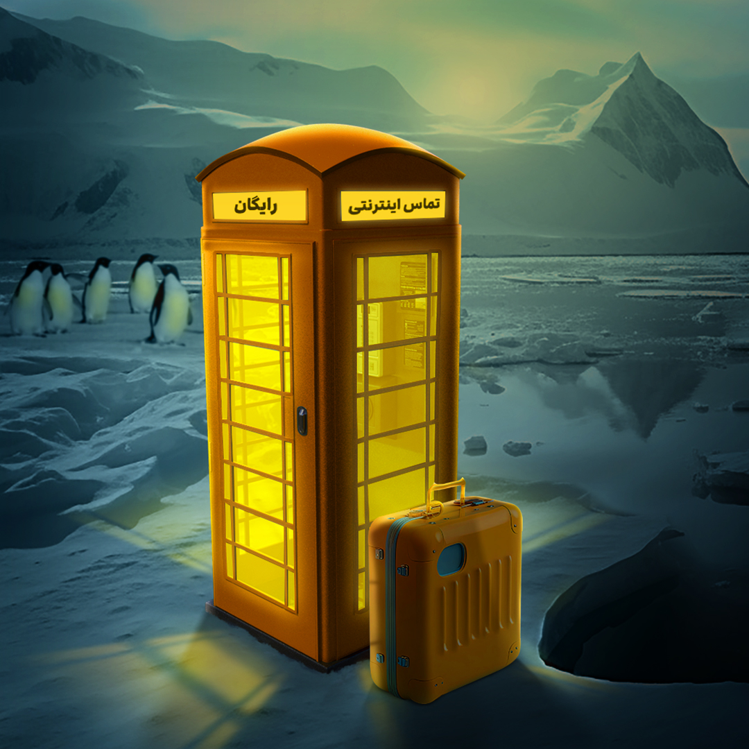
The campaign focused on communicating free internet calling through its strongest value proposition: staying connected from anywhere in the world.
To translate this message into a simple and recognizable visual idea, the phone booth became the campaign’s key motif — a familiar symbol of communication placed across different travel destinations to visualize the idea of being always within reach.
The key visual was then expanded across multiple locations and scenarios, creating a flexible visual system while maintaining one consistent campaign identity.
My Role: Concept Development, Art Direction, Key Visual & Visual Expansion

SOCIAL MEDIA
For Directors’ Day, we reimagined food through the visual language of cinema — imagining what each director might cook if their filmmaking style became a dish.
Taste the City — Tapsi Food × Shab
A collaborative social media series exploring what to eat in each city. Each post pairs a local landmark with signature regional dishes, turning food discovery into a simple visual guide to the flavors of different destinations.
Selected Social Media Works
A selection of social media visuals, each developed around its own idea, concept, and visual direction. From occasion-based content to playful product storytelling, every piece was designed as an individual creative response rather than following a single repetitive format.